news
1
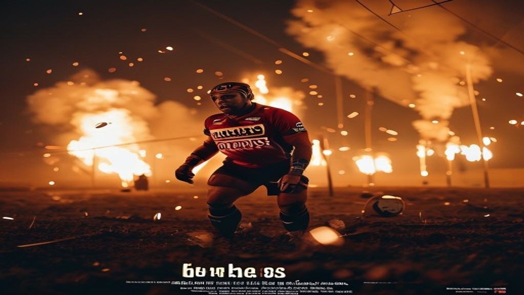
50-Cap Gaza Lights Up the Night – And SA Rugby Mag Just Dropped the Ball
July 05, 2026
While the Boks are prepping for another tilt at the World Cup, SA Rugby Magazine decided to grace its latest cover with a photo of Gaza… lit by flares, and the tagline '50-Cap Heroes'. Jislaaik, what were they thinking? It’s the kind of kak that makes you question everything, bru. Seriously.
## So, What Exactly *Is* the Story?
The cover in question features a stark image: flares illuminating the night sky over Gaza. Below it, the magazine proclaims “50-Cap Heroes.” The immediate backlash was…swift. People were rightfully asking what on earth the connection was between the Springboks, celebrating athletic achievement, and a region ravaged by conflict. It’s not a subtle connection, it’s…non-existent. The image and tagline were released, well, just like that. No warning, no context, just *boom*.
## ‘Honouring Resilience’? More Like Tone-Deaf, Bru
SA Rugby Magazine’s attempt at an explanation has been less than stellar. They claimed it was about “honouring resilience.” Resilience? Seriously? Comparing the dedication of rugby players to the daily struggle for survival in a war zone isn’t honouring anyone, it’s deeply, profoundly insensitive. It's like saying a braai is the same as facing a lion in Kruger. It just doesn’t track. They’re trying to pull a fast one, and frankly, it’s insulting. They seem to think slapping a feel-good word onto a deeply problematic image somehow absolves them. It doesn’t. It makes it worse. This isn’t about avoiding controversy; it’s about basic human decency. You’d expect better, even from a publication that sometimes feels like it’s stuck in the 90s.
## The Social Media Storm: SA Weighs In
The internet, as always, had *opinions*. South African Twitter, Facebook, and Instagram exploded. The hashtag #SARugbyMag was trending for all the wrong reasons.
* “This is beyond tone-deaf. It's actively harmful,” one Twitter user posted.
* “What were they smoking at SA Rugby Magazine?” another questioned.
* “Imagine trying to explain this cover to someone affected by the conflict. Kak!” a Facebook user commented.
Even those usually more measured in their responses were critical. There was a lot of discussion about whether the magazine had simply misjudged the situation, or if this was a deliberate attempt to generate controversy. The consensus? It’s a mess, bru, a proper mess. You’d think they’d have run this past someone – *anyone* – before sending it to print.
## Is This Just Bad PR, or Something Worse?
The potential damage to the SA Rugby Magazine brand is significant. This isn't a case of a slightly off-colour ad; it’s a fundamental misstep in understanding their audience and the world around them. The magazine risks alienating readers, sponsors, and the wider rugby community. Is this a genuine misstep, a moment of breathtakingly poor judgment? Or was this a calculated (and spectacularly failed) attempt at ‘edgy’ content? It feels like the latter, which is even more concerning. They seem to have prioritised shock value over sensitivity and respect. It's the kind of thinking that gets you cancelled faster than a Bafana Bafana coach after a Nations Cup loss.
## Where Does This Leave the Boks’ Brand?
The Springboks are a national treasure. They represent unity, resilience, and pride. This controversy, while not directly involving the team, *could* tarnish their image. Sponsors – think First National Bank, Standard Bank, Toyota – won’t be thrilled about being associated with a publication that pulls a stunt like this. Will they distance themselves? It’s possible. The Boks need to be careful. They need to reinforce their own values and demonstrate their commitment to social responsibility. A strongly worded statement from SA Rugby would be a good start. They can’t let this drag their brand through the mud. It's like letting load shedding ruin your Sunday braai – unacceptable.
## Lessons Learned (Hopefully): A PR Disasterclass
What can other brands and publications learn from this epic fail? Plenty.
* **Context is king.** Understand the cultural and political sensitivities surrounding your content.
* **Think before you publish.** Run your ideas past a diverse group of people before going live.
* **Authenticity matters.** Don’t try to be something you’re not.
* **Don't confuse shock value with substance.**
Checkers Sixty60, Takealot, Nando’s – they’ve all built their brands on understanding the South African consumer. They wouldn’t dream of pulling a stunt like this. They know that respect and relevance are far more valuable than cheap clicks.
## Beyond the Cover: What *Should* SA Rugby Mag Be Covering?
Instead of seeking controversy, SA Rugby Magazine should focus on the real stories within South African rugby. They should be highlighting grassroots development programs, showcasing emerging players, and tackling the challenges facing the sport. They should be celebrating the successes of local clubs and schools. There’s a wealth of compelling content out there, but it requires effort and a genuine commitment to the game. They could, for instance, delve into the challenges faced by players transitioning from school rugby to professional leagues. Or they could investigate the impact of financial constraints on smaller rugby clubs. These are the stories that matter, the stories that will resonate with readers.
This whole saga is a masterclass in PR befokery. SA Rugby Magazine has managed to offend a lot of people, damage its own brand, and potentially jeopardise the reputation of the Springboks. It’s a spectacular own goal.
The verdict? This cover was a colossal failure. It was insensitive, tone-deaf, and ultimately, just plain stupid.
But here’s the question: can SA Rugby Magazine recover from this mess, or have they permanently damaged their credibility? Click here to find out what the experts are saying about the future of the magazine and the potential fallout from this PR disaster.